Content Strategy
It is essential that each uploader to Malone's website pay attention to this document. We want a website that is fresh, warm, inviting, and compelling. Please review the PDF before adding new content, and always keep the audience in mind when creating or editing content.
Creative objectives of www.malone.edu
- Clearly articulate Malone's commitment to the Christian faith and demonstrate how it illuminates all facets of the Malone Experience using stories, profiles, testimonials, and rich multimedia content.
- Promote ways, both big and small, that prospective students can experience Malone in person, whether that's coming to visit campus or simply talking one-on-one with an admissions counselor.
- Create a more genuine and friendly collegiate atmosphere on the website by tastefully interjecting more fun and interesting interactive areas through the online experience.
- Highlight the relationships and supportive community at Malone that enables transformative growth and helps prepare students for life after college.
Voice & tone
What is Meant by "Voice" and "Tone"?
(An excerpt from the Content Strategy Guide) The voice of a website is a company's public personality. It comes through in our content and influences how Malone is perceived. Tone changes to fit the situation. While voice is about you (Malone),
Keywords
- Intentional
- Christ-centered
- Humble, yet confident
- Warm
- Transformative
(An excerpt from the Content Strategy Guide) The above are the Voice & Tone keywords from some of the framework documents for creating our website. A piece of content doesn't need to fulfill every word, but care should be taken to avoid undermining these values.
Font Styles/Headings
Please note that users are not allowed to select colors or fonts - those have already been determined. However, make use of the "format" options to organize content, especially headers. Headers must be used in succession: there must be a Header 2 before there can be a Header 3, etc. Feel free to contact University Relations if you have additional questions about this.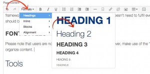
Tools
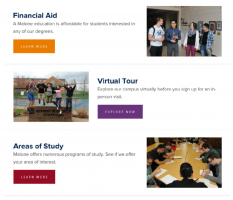 Topic Rows
Topic rows are a versatile & useful component. They are often used to break up long sections of text that have multiple topics or to highlight various topics within a larger category. Topic rows are not meant to give a user all of the information about a specific topic at
This component can be used just once on a page, or you can use multiple Topic Rows in succession. When only one is used, there will be a divider beneath the row. To add a topic row:
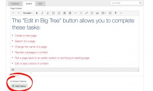
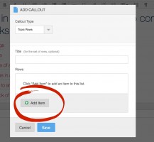
- Select "Add Callout" from In-Content Callout
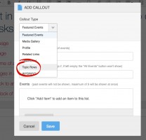
- Select "Topic Rows" from the dropdown menu
- You are welcome to name the Topic Row if you wish, it is optional. Next, select "Add Item."
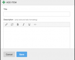
- Fill out the title of the Topic Row and a short blurb. These are both required elements.
- Upload an image (optional). The image must be a minimum of 300x300
pixels, but is typically pared down to about 300x200 pixels [3x2 ratio]. You may also add as many as two items to the list, but keep the titles short, as they show up as colorful buttons on the page.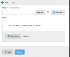
 Related Links
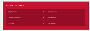
The Related Links module is helpful when there is additional content that expands upon a certain topic. Using this component will allow you to provide your target audiences with key content destinations quickly and efficiently. Featuring links also will encourage exploration throughout the site.
- Select "Add Callout" from In-Content Callout

- Select "Related Links"
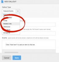
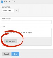
- Add a title if you wish; it is optional. Next, select "Add Item."
- Add the title of the link in the "Title" area. If you are linking to something in Malone's site, begin typing in the letters of the page you are looking for, and it will give you options of live pages for you to select. If you are linking to something
not on Malone's site, please just copy and paste the URL into the box. Once you have added your link, click "Save."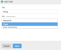
 Media Gallery
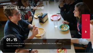
The Media Gallery is how you can display multiple images and/or videos. Make sure that you name your galleries and add captions to your pictures or videos to provide the user with context.
Also, be cautious of where on the page you add your Media Gallery. Try your best not to place it next to another component with a large image, somewhere it might distract a user from completing a task, or in a place that would delay someone from getting important information.
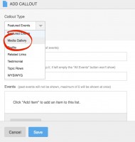
- Select "Add Callout" from In-Content Callout

- Select "Media Gallery."
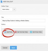
- Add a title. Select "Add Photo" if you're adding a photo.
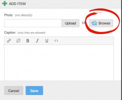
- Select a photo. The minimum pixel size for a photo is 980x552. Ignore the "Upload" button, as it will not put the photo into a proper folder. Select "Browse."
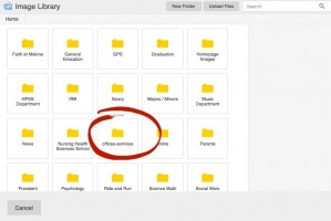
- The "Browse" button will take you to all the folders in the system. Select the folder that you need.
- Select "Upload Files"
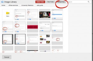
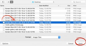
- Select a file from your computer and click "Open."
- Select the photo you would like to use by clicking it, and part of the photo should turn blue. If the file is large enough to be used in a media gallery, it will be available to select,
otherwise it will be greyed out. Next, click "Use Selected Item."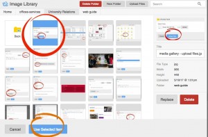
- Repeat to use as many photos as you would like. To rearrange
the the order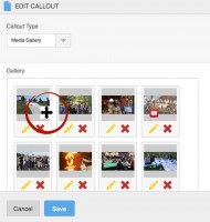
- To use a video instead of a photo, select "Add Video" (YouTube or Vimeo are fine; you'll just be adding the link." If you have a video clip that is not on YouTube, send it to University Relations, and if appropriate, we'll add it to Malone's YouTube channel.
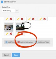
- Insert the URL from the YouTube
Video , and add a caption. Then select "Save."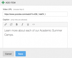
- Click "Save" and your Media Gallery is added.
 Testimonial
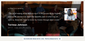
Testimonials offer an opportunity to hear directly from Malone students, faculty, and alumni in their own words. Make it a habit to regularly gather quotes from folks in
When attributing the source, include a photo, their name and graduation year (if applicable) as well as any distinctive information about their current role.
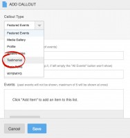
- Select "Add Callout" from In-Content Callout

- Select "Testimonial" from the list
- Select a background image. The image must be a minimum pixel size of 1440x740. (See Uploading images for detailed instructions of how to add images.)
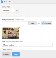
-
Add the additional details
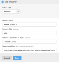
-
Select the smaller image and add a compelling quote.
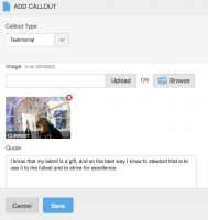
-
Save the Testimonial you just created.
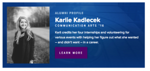 Profile
The Profile module is designed to showcase individual students and faculty. Include a paragraph sharing some of their
Photographs should be professionally shot and capture the subject's face and expression clearly.
For faculty members,
- Select "Add Callout" from In-Content Callout

- Select "Profile" from
list .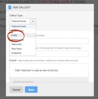
- Begin filling out the Profile information
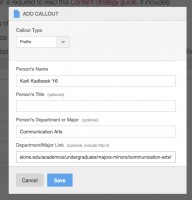
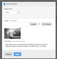
- Select an image (here's how if you need to: Uploading images) and write a brief description—there's a maximum of 200 characters.
- If applicable, add a link.
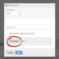
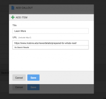
- Click "Save" to save the link and "Save" to add the Callout, and your Profile will be added.
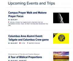 Featured Events
Use the Featured Event component when you want to call attention to upcoming events. Events must be added manually in the CMS and should include a
- Select "Add Callout" from In-Content Callout

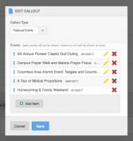
- The callout automatically defaults to "Featured Events," so you may simply begin filling out the information. After you fill out a Title and All Events Link (if applicable), begin adding items.
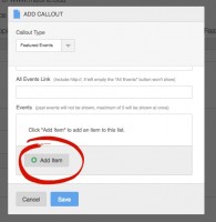
- Add a title of the event and select a date from the calendar.
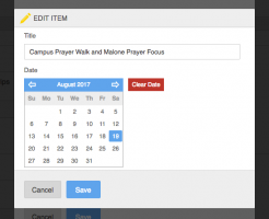
- Enter an End Date and Time. You may leave the End Date blank if it is an event that takes place over a few hours, rather than a few days.
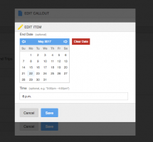
- Enter the Location Name and an Image of at least 300x300 pixels. Both are strongly suggested but optional.
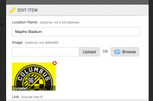
- Enter a link for more information if one is available.

- Continue adding events if there are more than one you would like to feature, and then click "Save" to add the callout. You may add as many events as you like, but only five will be shown at once, so if you want to feature more than five on the same page, simply add a new callout (you may add as many as you like). Also, once the date has passed, the event will automatically not display. However, it will not be deleted from the callout, so if it's an annual event, you can update the event to reflect the next year (or month, or semester, etc.).
WYSIWYG
This "What you see is what you get" Callout allows you to add regular text in between other modules.
- Select "Add Callout" from In-Content Callout

- Select "WYSIWYG"
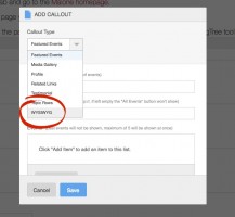
- Edit this as you would regular page content, save, and your work will be added.
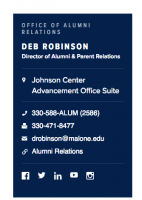 Contact Information
Personal connections are important to who Malone is, so if a prospective student is exploring your website, it should be easy for them to get in contact with you.
This component will allow you to add contact information to the sidebar of any subpage. Many of the fields are optional, so you can use this for people, offices, or departments.
If you are using this component with other sidebar components, it is best to put the Contact Information closest to the top of the page.
NOTE: A number of Contact Information Callouts have been created in the "Reusable Callouts" section (see the instructions following this entry), so check to make sure if one exists before you add a new one. It is important that the style and information
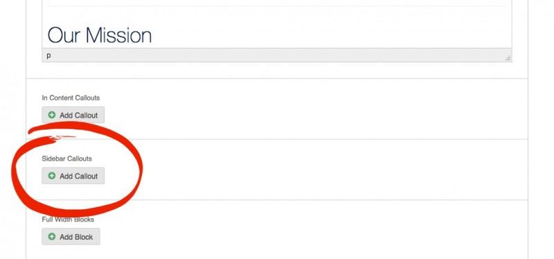
- Select "Add Callout" from the "Sidebar Callouts."
- Remember to search through the Existing Callouts to see if one exists for your area. They are
listed in alphabetical order.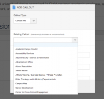
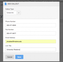
- The Title field automatically defaults to "Contact Info." Fill out the rest of the form. Unless the
end user would likely be mailing something, simply use the office location rather than a complete mailing address.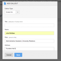
- Continue filling out the form... please note that phone numbers should be separated by dashes. No parentheses or periods should be used.
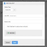
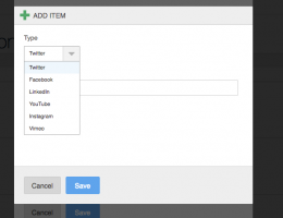
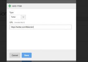
- Note that social media links may also be adding by clicking "Add Item" and simply pasting the URLS of the user's social media sites to the page. Available options include Twitter, Facebook, LinkedIn, YouTube, Instagram, and Vimeo.
- Click "Save" to add your callout.
Reusable Callouts
Reusable Callouts are callouts that you want to use on more than one page. For the "Normal User," they can be used for Contact Info, Image/Video Headers or Special Headers, Featured Events, Media Galleries, Profiles, Related Links, Testimonials, Topic Rows, Why Malone?, or WYSIWYG Callouts.
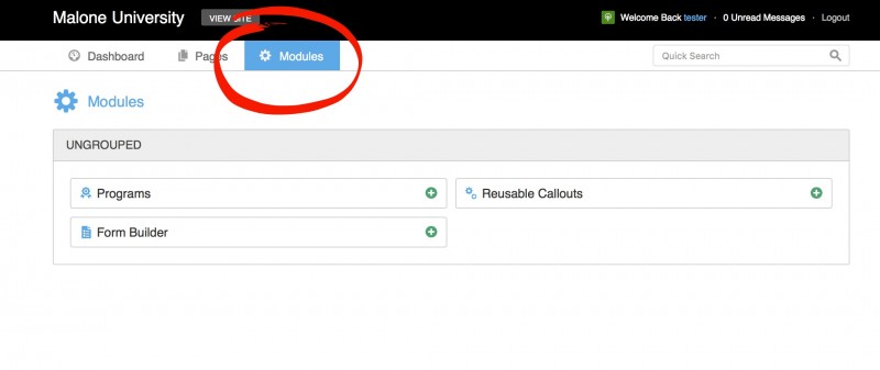
- Navigate to the "Modules" section.
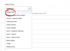
- Select which Reusable Callout you'd like to create.
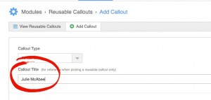
- Be sure to name your callout in the "Callout Title." After it is saved, it will be available for use by all content uploaders and listed by type and in alphabetical order.
- Fill out your selected Callout type by the instructions shown above.
